HP Design System
One of the biggest projects I’ve worked on to date was revamping HP.com’s design system to match its new branding. Our UX team began with basic elements, from font styles, colors, and buttons to the components. I implemented the use of Adobe XD’s cloud library to achieve coherence for collaborative work. It was a challenge to translate the visual identity guidelines for digital experiences, especially for the web components. Beyond just a change in UI, we evaluated the existing functionality for certain components and updated them for better UX. We condensed the component library to have fewer components that could achieve more as to simplify the page building process for content authors. See our work here.
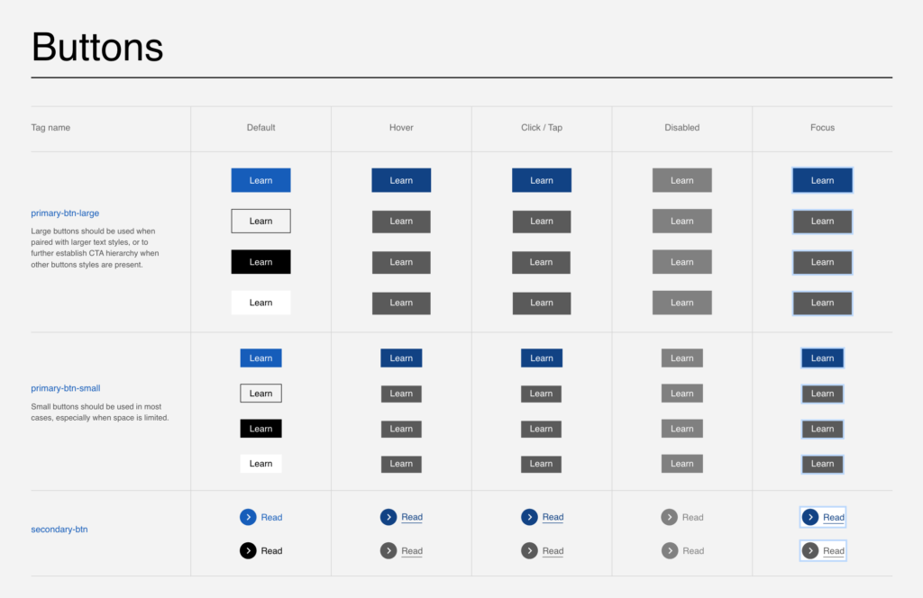
Below, I’m highlighting one component’s UX that I had fun exploring.
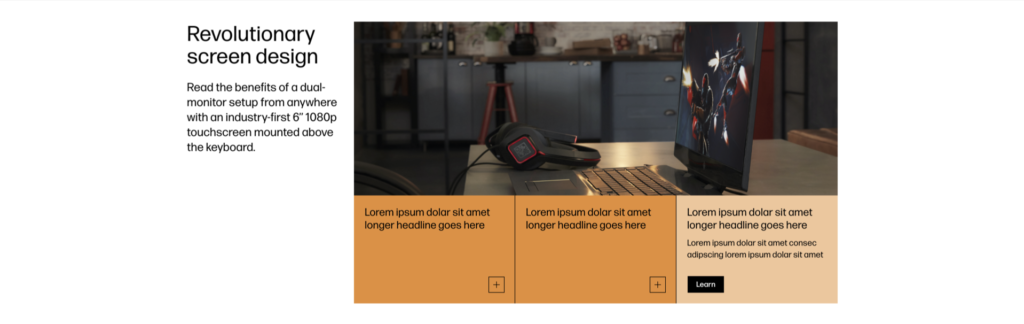
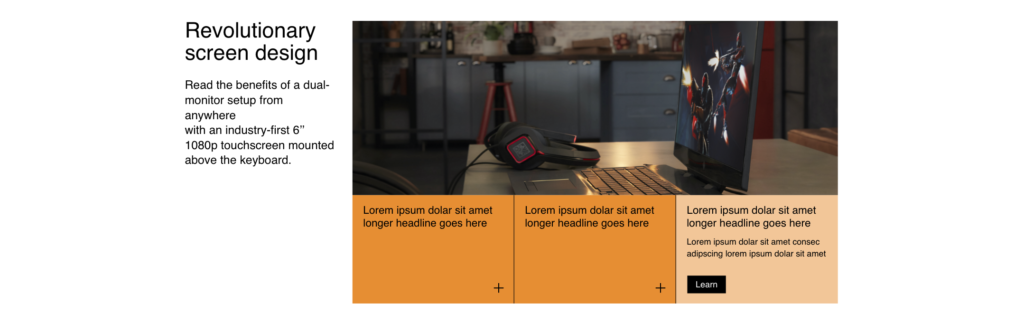
This component is called “Horizontal Content Switcher,” and is intended to show different images (or other media) when a card is clicked. Many of our updated buttons have outlines like the ones shown in Figure A, which come with an expected experience when hovered or clicked, as opposed to a buttons without outlines. If the buttons with outlines were to be used for this component, the expected behavior would be that the button changes colors on hover and the card would change only when the button is clicked. After receiving some feedback, I also designed a version (Figure B) that uses an expand button that has no outlines (and does not match the rest of the buttons in our library) but acts in a way that is more intuitive and consistent with other experiences. For the version shown in Figure B, the entire card is clickable vs. just the button and would change colors on hover and then expand to the clicked state. While this would mean an added step for developers, the team and others agreed that Figure B was a better solution.